Sunday, February 15, 2009
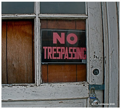
Two Things Challenge: Corner / Door
This week's challenge was Corner / Door. To see how others interpreted this challenge or to participate in future challenges, visit Two Things Challenge.
Photo copyright: D.C. Confidential
Subscribe to:
Post Comments (Atom)


12 comments:
I really enjoy your blog. This image today really captivated me at the portal. Beautiful, sensitive shot.
Wonderful shot of Lincoln on your masthead. Love the close-up of the corner too.
I like the feeling the flakey paint and broken door create. Very good :)
Good interpretation of the challenge this week! I love the corner and the door. What is it about peely paint??
V
This industrial corner is so interesting for all it's color and there is something about a 'No Trepassing' sign that is so alluring. I always want to find out why.
B.C.: Thanks! I appreciate that. The corner of this building really struck me, too. I'm glad you like it.
Birdman: Thanks! The Lincoln shot on the masthead has proven quite popular and I've sold a few of that one. I'll be releasing it in signed, limited edition soon.
Marley: Flaky, weathered paint is so inexplicably evocative, isn't it?
VJ: I don't know. Marley and I were just wondering that, too! :-)
Andrea: Me, too. Me, too! Come on over and we'll check it out together.
Nice shots. I especially like the green on the corner. I may have a good shot for this challenge, but I'm not sure when I will get it processed since I took it on my trip. Ah well.
Great shots Janet! I'bve enjoyed both. Great theme too. I left an award for you on my art blog yesterday....you've been caught!
Maya: Thanks! I like the corner shot, too. Whenever you post your photo, let me know and I'll post a link to your contribution. It's never too late!
Lisa: Thank you! And I'll be sure to head over to your blog and check out my latest award. Thanks for the shout out!
I really like the first photo. Something about the random, mottled pattern of the green on off-white. I looked at it a long time.
I like this industrial looking scenes. It has an appeal different from beautiful architecture; it has aged beauty.
Chosha: Would you consider that first photo "suitable for framing"? Just curious, as I'm trying to expand my portfolio of photos I'm going to sell.
Rob: I had a lot of pictures of pretty corners and doors, but I really liked the weathered look of these. Glad you like them!
Post a Comment